Hi all!
I'm excited to pitch a collection of enhancements to Swift-DocC's authoring support for reference (non-tutorial) documentation pages. The goal here is to push reference documentation a little bit beyond what base Markdown will allow and give developers enough tools to create truly unique documentation pages.
I'm particularly excited for what this can mean for conceptual style documentation that lives alongside API documentation. Since its release, Swift-DocC has had the flexibility to support all of a project's documentation: from tutorials, to in-depth articles, to API reference. Improving the authoring capabilities for non-tutorial, conceptual documentation pages is a natural next step for the tool.
Additionally, these enhancements will begin to open up Swift-DocC to folks interested in using the tool for more book-like content, like The Swift Programming Language. In the new few days, I'll be publishing an additional pitch that outlines new support for customizing some of Swift-DocC's default behaviors to complete this general story: including customizing page icons, Topic sections, and See Also sections.
This pitch is structured around a number of new directives that will be introduced to Swift-DocC. These directives will be valid in any regular (non-tutorial) documentation page in a DocC catalog. This includes any regular markdown file and any documentation comment.
I'm looking forward to your feedback around the naming and behavior of these directives.
@Image
@Image is an existing directive used in tutorial content. The proposed change here is to begin supporting @Image directives in regular documentation pages and thereby add support for image captions in reference documentation.
The @Image directive will now be able to contain text to form a caption for the image.
Examples
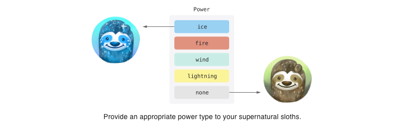
@Image(source: "sloth-powers.png", alt: "A diagram with the five sloth power types: ice, fire, wind, lightning, and none.") {
   Provide an appropriate power type to your supernatural sloths.
}
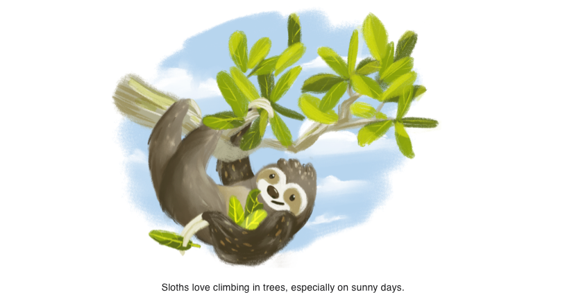
@Image(source: "sloth-in-tree", alt: "A sloth hanging off of a tree.") {
   Sloths love climbing trees, especially on sunny days.
}
@Video
Similar to the above @Image directive, the proposed change here is bring the existing @Video directive from tutorial pages to regular documentation pages and thereby begin supporting videos in reference documentation pages.
The @Video directive will add the following parameter:
alt: (Optional) A description of the video for accessibility.
Additionally the @Video directive will now be able to contain text to form a caption for the video.
Examples
@Video(
   source: "sloth-smiling.mp4",
   poster: "ice-power.png",
   alt: "A short video of a sloth jumping down from a branch and smiling."
) {
   A happy sloth. 🦥
}

@Row {
   @Column {
      @Video(
         source: "ice-sloth.mp4",
         poster: "ice-power-sloth.png",
         alt: "Video of a blue sloth demonstrating their ice powers."
      )
   }

   @Column {
      @Video(
         source: "fire-sloth.mp4",
         poster: "fire-power.png",
         alt: "Video of a red sloth demonstrating their fire powers."
      )
   }
}

@Row {
   @Column {
      @Video(
         source: "wind-sloth.mp4",
         poster: "wind-power.png",
         alt: "Video of a teal sloth demonstrating their wind powers."
      )
   }

   @Column {
      @Video(
         source: "lightning-sloth.mp4",
         poster: "lightning-power.png",
         alt: "Video of a teal sloth demonstrating their lightning powers."
      )
   }
}

@Row(numberOfColumns: 2) {
   @Column(size: 1) {
      @Video(
         source: "avatar-sloth.mp4",
         poster: "all-powers.png",
         alt: "Video of the avatar sloth demonstrating their ice, fire, wind, and lightning powers."
      )
   }
}

@Row
In order to support more custom page layouts, a @Row directive will be added to allow for authoring custom grid-based layouts.
The design of Row is loosely based on the common 12-column layout system as well as CSS’s grid system. However, I don’t think an understanding of either of these systems should be a requirement for using Swift-DocC’s system so I’ve tried to strike a balance between the power and familiarity of these systems and some reasonable constraints within the context of documentation authoring.
Important: This new directive will live alongside Swift-DocC's existing markdown table support and its upcoming support for row and column spanning.
The main differences are that
@Rowwill allow for multiline content, will not render dividing lines between elements, and will auto-collapse on mobile viewports. The expectation is that content rendered in a markdown table needs to be rendered as a table for the information to be conveyed. While content in a@Rowwould ideally be rendered side-by-side in a row on desktop viewports but should be collapsed on mobile viewports for easier reading.
The @Row directive will contain @Column directives that can contain arbitrary Swift-DocC markup content.
@Row will accept the following parameters and only accept @Column child elements:
numberOfColumns: (Optional) The number of columns in the row. Defaults toautomaticif not specified.
@Column will accept the following parameter:
-
size: (Optional) The number of columns the column is allowed to span. Contains either a numeric value between1and the number of columns in the parent row orfill. Defaults tofill.If a numeric value is given, it describes the number of columns the column is allowed to span. If
fillis provided, the column will grow evenly with otherfillcolumns to take up the available space. Defaults tofill.If any columns are specified with a numeric
sizethen the parent@Rowdirective must specify anumberOfColumnsnumeric value.Empty Columns can be used to create gaps in a Row.
Note: All parameters for
@Rowand@Columnare optional which should allow for a very simple experience by default.
Examples
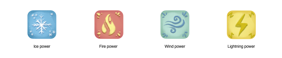
@Row {
   @Column {
      @Image(source: "icon-power-icon", alt: "A blue square containing a snowflake.") {
         Ice power
      }
   }

   @Column {
      @Image(source: "fire-power-icon", alt: "A red square containing a flame.") {
         Fire power
      }
   }

   @Column {
      @Image(source: "wind-power-icon", alt: "A teal square containing a breath of air.") {
         Wind power
      }
   }

   @Column {
      @Image(source: "lightning-power-icon", alt: "A yellow square containing a lightning bolt.") {
         Lightning power
      }
   }
}
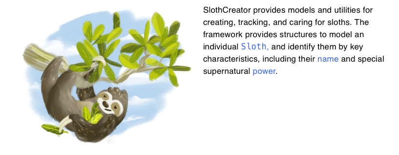
@Row(numberOfColumns: 3) {
@Column(size: 1) {

}
@Column(size: 2) {
SlothCreator provides models and utilities for creating, tracking,
and caring for sloths. The framework provides structures to model an
individual ``Sloth``, and identify them by key characteristics, including
their ``name`` and special supernatural ``power``.
}
}
@TabNavigator
A new @TabNavigator directive that contains @Tab directives- describing a tabbed interface element.
Tab navigators allow authors to make several images or videos available on a page without overwhelming the reader by making them all visible at once. It’s a great tool for comparison of different visual elements especially when comparing three or more images where displaying them side by side could be distracting.
@Tab accepts the following unnamed parameter and can include any kind of content:
name: The name of the tab for presentation purposes.
Examples
@TabNavigator {
@Tab("Powers") {

}
@Tab("Excerise routines") {

}
@Tab("Hats") {

}
}

@Small
A new @Small directive based on HTML’s small tag. This directive can be used to specify small print like legal, license, or copyright text that should be rendered in a smaller font size.
@Small accepts no parameters and accepts arbitrary DocC markup body content.
Examples
You can create a sloth using the ``init(name:color:power:)`` initializer,
or create randomly generated sloth using a ``SlothGenerator``:

   let slothGenerator = MySlothGenerator(seed: randomSeed())
   let habitat = Habitat(isHumid: false, isWarm: true)

   // ...

@Small {
    Licensed under Apache License v2.0 with Runtime Library Exception
}

To keep your sloths happy and fulfilled, you can create activities for them
to perform. Define your activities by conforming to the ``Activity`` protocol and
implementing the ``Activity/perform(with:)`` method:

   struct Sightseeing: Activity {
       // ...
   }

@Small {
    Be careful when performing actitivites with your sloths.
    Sloth energy should never be decreased lower than 100%.
}

I’m looking forward to hearing your feedback on these new directives. Opening up Swift-DocC with tools like @Row and allowing folks to create unique documentation experiences that are specifically catered to the technology their teaching is going to be a really great thing for the Swift documentation ecosystem.