Hello everyone,
My name is Kelvin Bui, and I'm excited to be participating in Google Summer of Code 2025 with Swift.org! My project, mentored by Stuart (@smontgomery), is the Improved Console Output for Swift Testing.
The main goal is to make the testing experience in Swift clearer, more useful for diagnosing failures, and more productive for all developers. After about a month of exploring different designs and gathering feedback, I'd like to share our current progress and ask for your valuable input on a few key design questions.
Motivation: Problems We're Trying to Solve
Based on community feedback and initial research, we've identified several key areas for improvement in the current console output:
- Difficulty understanding test relationships: Without a clear visual structure, it can be hard to see how tests are organized into suites, especially in projects with many tests.
- Difficulty locating failures: In large test runs, failures can be lost in a long sea of success messages, making it hard to quickly assess the health of a run, especially in CI logs.
- Lack of "liveness" and progress indication: The current output is a static log, which doesn't provide a real-time sense of progress or how much work is remaining.
The Core Challenge: "Liveness" vs. a structured hierarchy
A central challenge we identified is the trade-off between providing a "live," responsive output and a perfectly structured hierarchical view. A live, indented hierarchy requires significant buffering of test results, which can cause a noticeable delay before anything is printed. This can make the test run feel slow or "stuck," especially when tests are fast and run in parallel.
Proposed Solution: A Two-Phase Architecture
To solve this, we are proposing a new two-phase architecture:
- Live Phase (while tests are running): This phase focuses on immediate, real-time feedback. The plan is to show a live-updating progress bar and print out notifications for issues (especially failures) as soon as they occur.
- Summary Phase (after tests have finished): Once the run is complete, we will print a comprehensive, detailed hierarchical summary. This summary will contain the full, structured tree of all suites and tests, along with their results and detailed failure information.
Demo & Mockups
We have focused on two distinct usage scenarios: users running from an interactive terminal, called the "Live Mode", and tests running in an automated system, the "CI Mode".
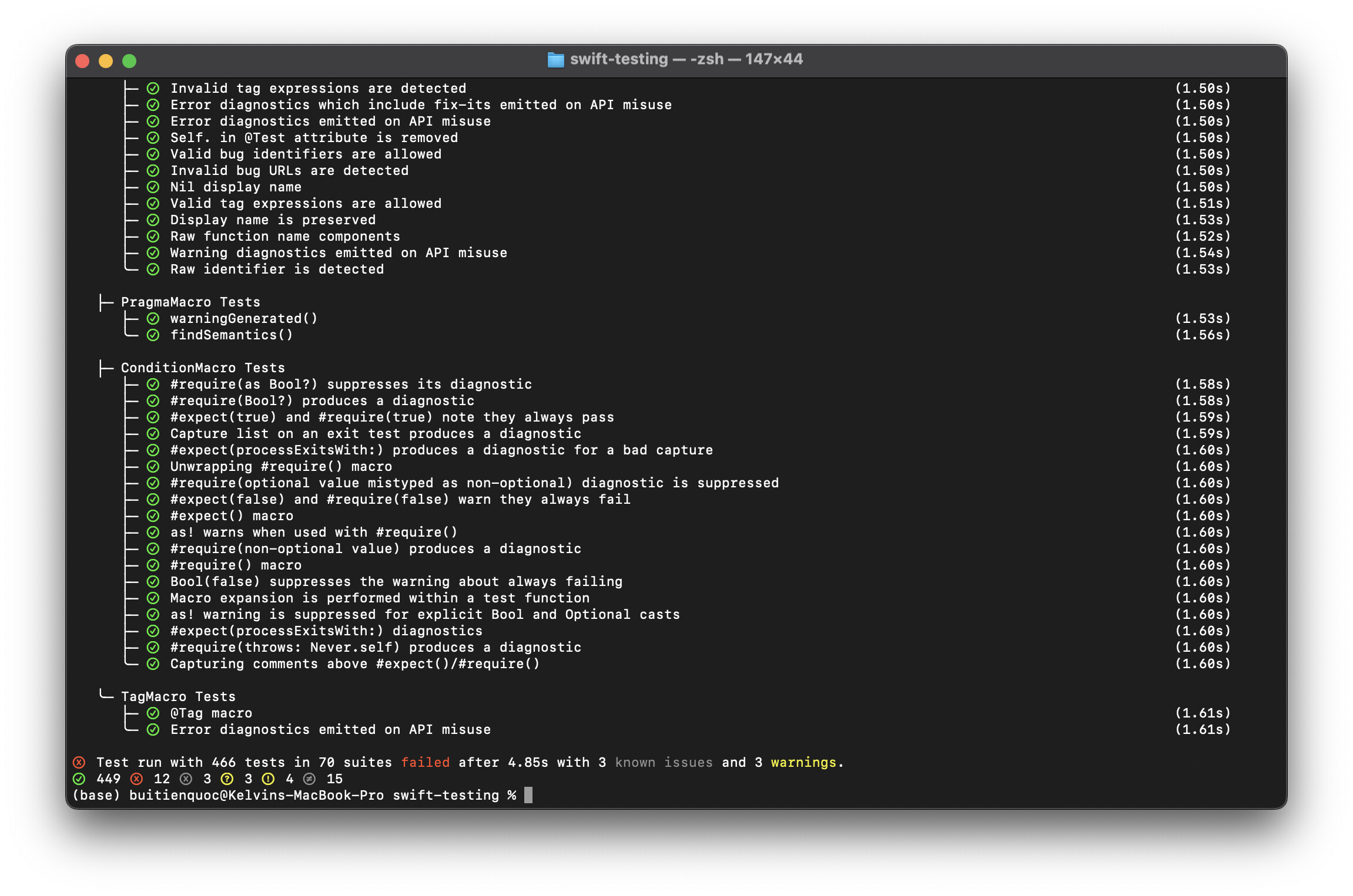
I've put together a short video showing an early implementation of the hierarchical output. It demonstrates how tests, suites, and issues can be rendered in a nested structure.
Click the image below to watch the demo video on Google Drive
To show the full vision, here are the latest mockups for both the Live Mode and CI Mode .


Request for Feedback
This is a work in progress, and we'd love to get the community's thoughts on a few key design decisions. Please note that these ideas have been presented to the Swift Testing workgroup but have not been formally endorsed yet.
1. Presentation of failures: integrated in the hierarchy vs separate section? In our new model, the hierarchy is printed at the end. This allows us to merge the detailed failure information (like the evaluated #expect expression and a trimmed stack trace) directly into the tree as sub-nodes. The alternative is to keep the hierarchy succinct and have a separate FAILED TEST DETAILS section at the very bottom.
- Question: Which approach do you prefer? A single, all-in-one hierarchical summary, or a cleaner hierarchy followed by a separate, detailed failure report section?
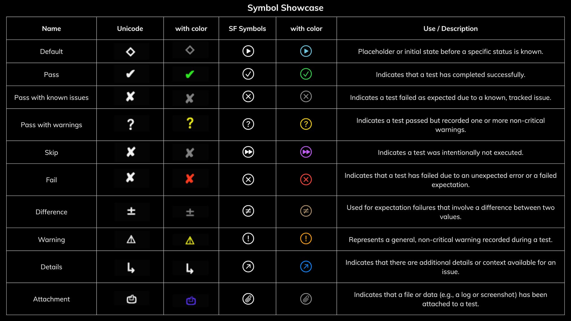
2. Use of symbols vs text for status indicators
We are considering two main styles for indicators like "pass" or "fail":
- Unicode/SF Symbols (e.g.,
✓,✗): SF Symbols look great and provide a rich experience, but they are specific to Apple platforms, leading to an inconsistent look on Linux and Windows. - Text Labels (e.g.,
[PASS],[FAIL]): These are 100% cross-platform compatible and are easily searchable in CI logs. - Question: What should the default experience be? Should we prioritize a consistent cross-platform look with text labels, and make symbols an opt-in feature?
Next Steps
Our immediate priority is to finalize the implementation of the hierarchical summary. After that, we will focus on building out the live progress bar and the final summary section with performance insights.
Thank you for taking the time to read this update. I'm excited to hear your thoughts and feedback!
Best,
Kelvin