Yeah, I'm not sure I'm really feeling it as proposed.
Here's a super-quick example of how it would look if we dropped the margins and the removed the hero background. Personally, I think it looks a lot better with fewer visual flourishes. Just MHO.
The body content still feels a bit "off" to me; it feels very narrow. The topics shortcuts give it a weird alignment, and I feel that perhaps the big sidebar is just serving to emphasise how much horizontal space is being wasted.

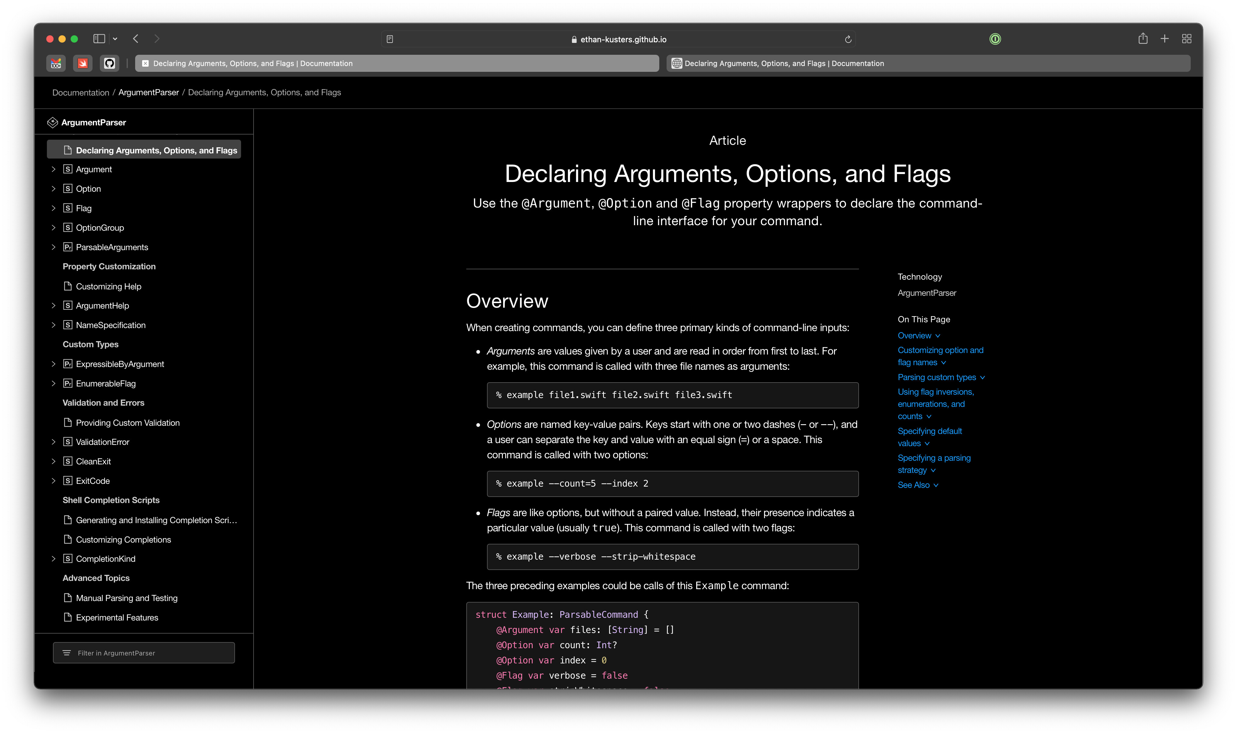
Also, on an iPad in portrait mode, the sidebar is very annoying. There really needs to be a button to hide it. The narrower width also makes code snippets basically illegible

